For most people, the CMYK acronym is only ever at the forefront of their minds during the occasional trip to Officeworks to buy ink. However, the reality is that the world would unquestionably be a bleaker place without the CMYK colour model, which is responsible for most colour printing. In fact, there are various colour models that all work in different spaces. For example, the colours you see on your screen belong to the RGB colour model, which is exclusive to electronic devices. You might be thinking, why do I need to know this, how does this affect me? Well, if you’re investing in a number of print products and want your printing to turn out exactly as you imagine it, then it helps to have an understanding of the different colour models. Here, we’ve stripped down the industry jargon to give you a summary of the main colour profiles and when to use them.
Before we dive in, to comprehend how the different colour models work, you need a basic understanding of the science of light and colour. Light is made up of wavelengths, and each wavelength is a specific colour. White light, such as the light emitted from the sun, is a combination of all the colours in the colour spectrum (the rainbow). When light shines on an object, certain wavelengths (i.e., colours) are absorbed, and others are reflected. We can only see the colours that are reflected off an object. For example, a red shirt will appear red because the dye molecules are reflecting red wavelengths back to us, but they are absorbing blue & green wavelengths, which we cannot see.
RGB Colour Model
RGB, i.e., red, green and blue (complicated, we know) is a colour model used only for electronic devices. This colour profile is additive because it involves starting with a black canvas and adding red, green and blue light to create colour. Light filters through the red, blue and green at different intensities, which results in colours of varying shades and hues. When all three primary colours are combined in their full intensity, you will see white (similar to the white light created by combining all the colours of the rainbow), whereas when they are at their lowest intensity, i.e., when your screen is switched off, you will see black (this is because of an absence of light, and therefore, an absence of colour). Bear in mind that no two screens are calibrated in exactly the same way, meaning that the same RBG colour may appear differently when viewed on two different screens.
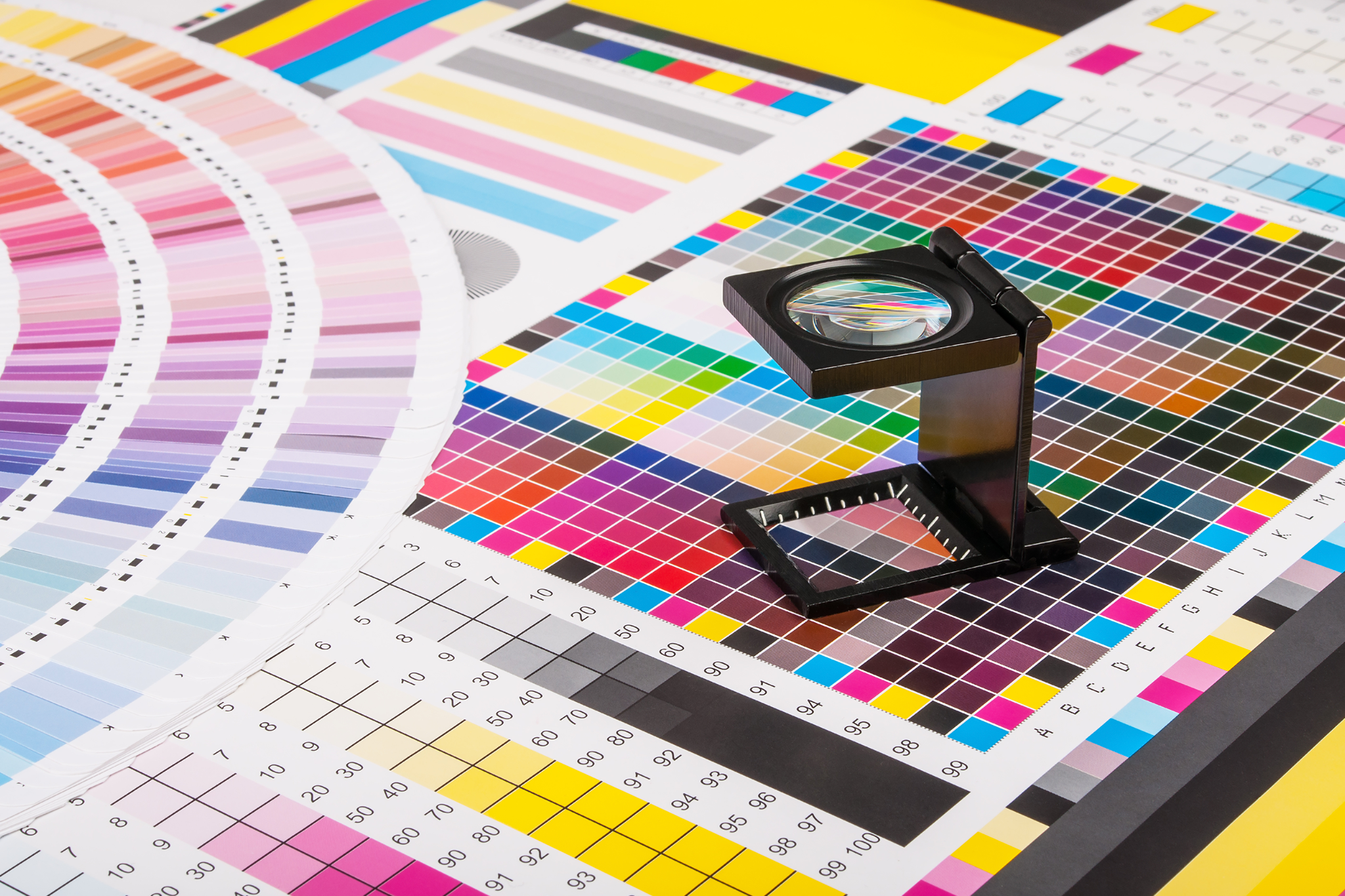
CMYK Colour Model
CMYK stands for Cyan, Magenta, Yellow and Key (Black), the four ink colours used in general paper printing. Black is referred to as ‘key’ because it supplies the contrast and detail needed to determine a final image. CMYK is a subtractive model, meaning the four ink colours are combined and added to a white piece of paper to absorb the white light being reflected from it. In other words, the ink removes the colours red, green and blue from the white light that is being reflected off the paper, leaving behind the cyan, magenta and yellow.
When printing, these ink colours are combined in varying percentages to produce a broader range of colours. CMYK colours will generally appear less vibrant than RGB colours on a screen, because rather than using light to create colour, CMYK relies on absorption by using ink. When you are printing something, keep in mind that the final product may vary from what appears onscreen, as the RGB and CMYK colour profiles are different. The CMYK colour spectrum does not include all the colours of the RGB colour spectrum, so if you’re designing something to print, you should do so in a CMYK colour space, that way you won’t have significant variations in colour once printed. Most design applications, such as InDesign or Photoshop, will allow you to work in a CMYK colour space. If you do forget to design something in CMYK, you can convert your design later, though you should expect to lose some colour in the process.
Before pushing print…
If you intend on ordering printed products, you should consider contacting a graphic designer to ensure that there will be minimal colour discrepancies between your design and your final product, particularly where it’s important that your printing looks a certain way. Depending on your design choices, printing can be expensive, so it’s best to consult with a printer or designer in order to avoid disappointment should your product not turn out as you expected. No one wants to experience the heartbreak of realising your gold wedding invitations more closely resemble mustard. If you would like some more information about the different colour profiles or would like some assistance from our printing or graphic design team, please do not hesitate to contact us today.