Printing Glossary

Printing terms can be confusing for someone who hasn’t had a lot of interaction with the design and print industries. We’re confident in assuming that unless you’ve had a specific need for aqueous coating, then you probably don’t know what it is. The day may come eventually when you’ll need to have something professionally printed, whether you’ll need business stationary, event invitations or branded t-shirts. So, we’ve put together a glossary of printing terminology that you can consult whenever you encounter a term that you don’t quite understand.

Aqueous coating – aqueous coating is a clear, water-based coating that is applied to the entirety of a printed material to protect it from damage. The coating is fast-drying and can achieve matte, gloss, satin or soft-touch finishes.

Bleed – bleed refers to ink that prints beyond the print area (i.e. the edge of a page). It’s important for documents to have a bleed section because printers are incapable of ensuring that every sheet of paper is perfectly aligned and does not move while being fed through the printer at high speeds. Artwork that does not have bleed areas will be printed with unwanted white borders.

Bleed size – bleed size refers to the total size of your artwork, including the bleed section.

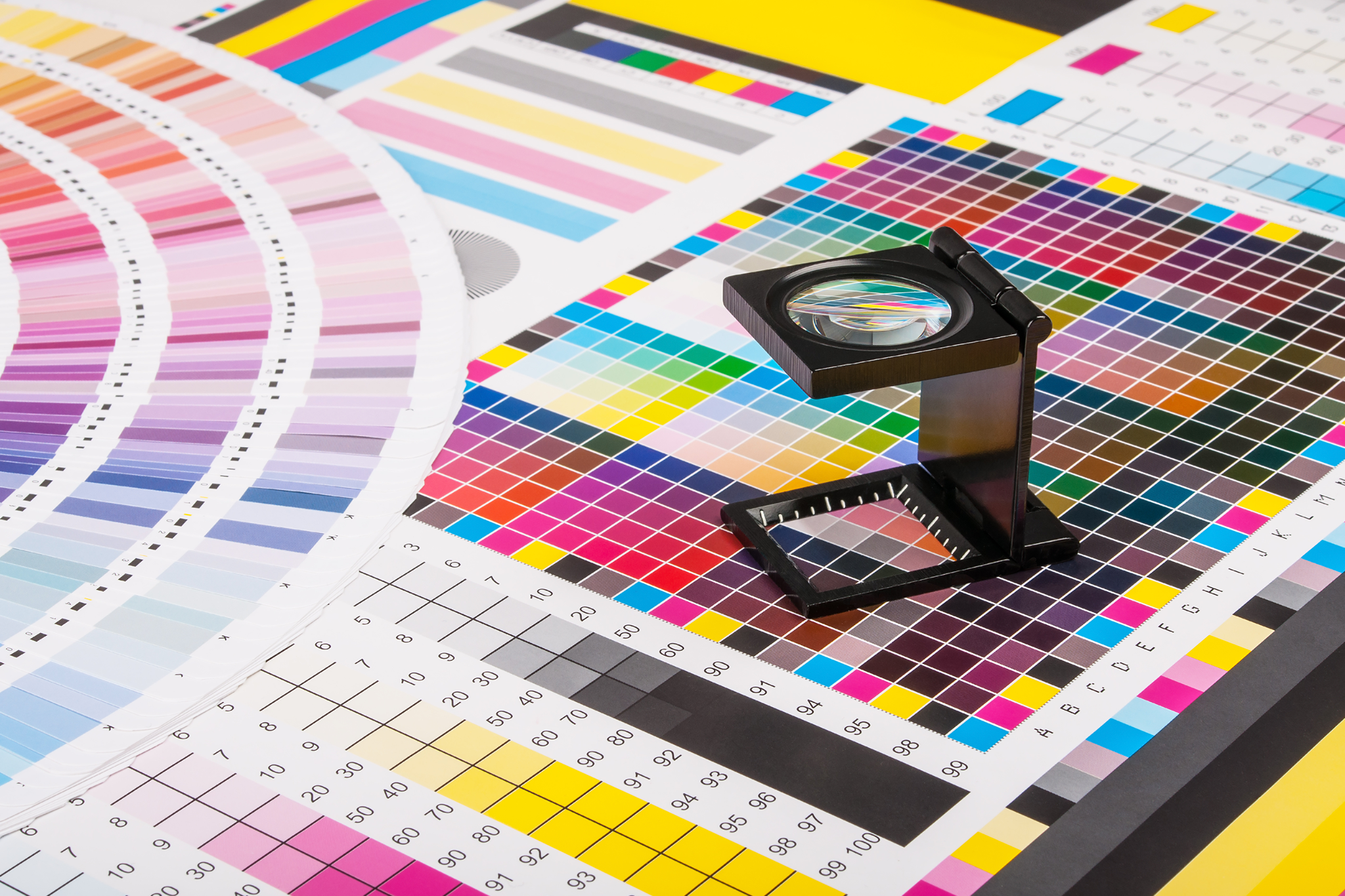
CMYK colour mode – CMYK stands for Cyan, Magenta, Yellow and Key (Black), the four ink colours used in general paper printing. When printing, these ink colours are combined in varying percentages to produce a broader range of colours. You can read more about the different colour modes in our blog, ‘Colour Me Curious’.

Coated paper – coated paper is paper that has been coated in clay to give it a smoother finish and to reduce its porosity, so that ink sits on top of the paper instead of being fully absorbed. Coated paper can have various finishes, including glossy, matte and silk.

Colour mode – colour mode refers to the colour setting used to create an image or artwork. CMYK and RGB are two examples of colour modes.

Crop marks – crop marks are merely indications of where a certain material must be trimmed or cropped.

Debossing – debossing is the process in which an image or text is imprinted onto a material to create an indent. You may have seen this method used on certain products such as diaries or notebooks.

Die cutting – die cutting refers to the process in which machinery and tools are used to cut printed materials into an array of shapes or designs.

Dieline – a dieline is essentially a template or diagram of a package that marks the placement of any creases, folds, cut lines, bleed or perforations. Dielines are created so that you can get a realistic idea of what a package will look like once it has been produced.

Embossing – embossing is a process in which tools and heat are combined to create raised text, designs or patterns on a printed material, resulting in a 3D effect.

Finish size – finish size refers to the final dimensions of artwork once it has been printed and trimmed.

Foil stamping – foil stamping involves the use of metal tools, heat and pressure to apply foil to a printed material. Foil stamping is often used on event stationary, such as wedding invitations. 

Four colour printing – four colour printing involves the use of (surprise surprise) four colours, namely, CYAN, MAGENTA, YELLOW and BLACK (also known as the CMYK colour model). These colours are combined in different concentrations to produce all the colours of the colour spectrum.

GSM – GMS stands for ‘Grams per Square Metre’ and refers to the weight of paper. The higher the density of paper, the higher the GSM will be. Paper with a high GSM tends to be more durable and harder to fold than paper with a low GSM.

Image resolution – image resolution refers to the quality of an image. When in digital form, image resolution is described in terms of its PPI (pixels per inch); images with higher resolutions will have more pixels per inch and will appear clearer and crisper. Printed images are described using DPI (dots per inch), i.e. the number of dots of ink that make up a printed image. Note that pixels are usually equivalent to dots, meaning, for example, that 300ppi will equal 300dpi.

Lamination – lamination involves the use of heat and pressure to bind a clear plastic film to a printed material in order to protect it from wear and tear. Laminate is available in different finishes, including matte, gloss and soft-touch. Read more about the different types of laminate in our blog, ‘The Low Down on Lamination’.

Low resolution images – low resolution images are images that are less than 250ppi. It’s best to provide images at 300ppi to achieve the best print quality.

Offset printing – offset printing (also known as lithography), is a printing method in which ink is transferred to a rubber cylinder which is then ‘rolled’ onto paper or card. This method is generally used for large quantities of print materials, such as newspapers.

Pantone Matching System – the Pantone Matching System (PMS) is a standardised colour matching system whereby each colour is assigned a distinct number to allow designers and manufacturers to accurately identify Pantone colours.

Perfect binding – perfect binding is a common technique used to bind booklets, magazines, catalogues and other soft cover books. The pages are bound along the spine using adhesive.

Pixel – pixels refer to the illuminated coloured dots that form digital images on a screen.

Proof – a proof is a representation of a printed material that shows how a final product will look. A proof is intended to verify the content, layout and colours of a design before it is printed.

RGB colour mode – RGB, (i.e., red, green and blue) is a colour mode used only for electronic devices. This colour model works by adding red, green and blue to a black canvas. Light filters through the red, green and blue at different intensities, which results in colours of varying shades and hues. You can read more about the different colour modes in our blog, ‘Colour Me Curious’.

Roll fold – a roll fold is a folding method whereby parallel folds are made to create multiple panels of the same size. The roll fold method is often used for brochures.

Saddle stitched – saddle stitching is a binding method whereby pages are bound along a central fold using staples. The pages will then be folded along the staple line to create a book.

Spot printing – spot printing uses colours created through the Pantone Matching System (PMS). As opposed to layering CMYK colours to achieve a particular colour, spot printing using the PMS allows you to create a single, solid colour that is precisely mixed. Colours printed using this method are more accurate than CMYK printed colours, which can result in discrepancies due to colours being applied in slightly different quantities.

Spot UV coating – spot UV coating is a transparent varnish that is placed on a printed material to create a glossy, premium finish. Unlike aqueous coating, spot coating can be applied to only part of a product, allowing some areas to remain matte and some to appear glossy.

Trim edge – the trim edge refers to the edge of your artwork where trimming will occur; anything that extends beyond the trim edge will be cut off.

Uncoated paper – unlike coated paper, uncoated paper does not contain any clay and is generally more porous, meaning ink is easily absorbed into the paper. Images printed onto uncoated paper do not appear as crisp as they would on coated paper.

Varnish – varnish refers to a liquid coating that is applied to the surface of a printed material in order to create a certain texture and to better preserve the material. Types of varnish include glossy, matte or soft-touch, a type of varnish that results in a velvety feel.

Z fold – a z fold is a folding method often used for brochures, in which paper is folded to create a pleated effect. This is achieved by each section being folded in the opposite direction to the one next to it.

We hope that this glossary of printing terminology has been helpful! If you have any questions about any of the terms explained in this blog (or any that we may have left out), please don’t hesitate to contact our team. We will do our best to break down any printing processes that you may have questions about and to work with you to find the best printing solutions for you.

Explaining the Essentials of Expo Signage

At expos, the choices are almost unlimited – there can be businesses from a myriad of industries all trying their best to achieve one goal: to get the attention of potential customers. This can be difficult to achieve amongst all the competition, however, one thing is perfectly clear – you’re much less likely to garner any serious interest from potential customers if your only signage is a piece of cardboard with your business name scrawled across it in permanent marker. Ok, this might be an extreme example, but we believe that effective signage at an expo is the secret to success. If you’re considering attending an expo in the future, read on for some suggestions on what and what not to do when it comes to your signage.

  1. Keep it simple

Expos are generally chaotic, there are hundreds of booths lined up and sometimes thousands of people navigating their way through the expo maze. So, we recommend keeping things relatively simple to avoid adding to the mayhem and inundating potential customers with information. If a person looks at your booth only to be met with layer upon layer of signage and posters, then their already overwhelmed eyes will inevitably wander elsewhere. Your signage should provide people with just enough information so they know what your business is and invite them to learn more about your services or products. After all, the average person will only glance at your sign for a few seconds, so they won’t be able to take in the important details if they’re buried in paragraphs of information or drowned out by an elaborate design. Not many people will stick around to try and decipher what your stall is about if it’s not immediately evident (unless you’re standing there handing out free cake or something, in that case, you’ll probably be the most popular one there).

  1. Use colour skilfully

Colour can be a fantastic way to draw the attention of someone walking by. When planning your signage, we recommend sticking to the colours in your branding colour palette. Using colours that are ‘off-brand’ will make your stall look chaotic and busy. Instead, use brand colours to draw attention to key information and areas in your stand. You also want to avoid confusing any customers with an existing interest in your services or products, who may not recognise your business because of the lack of cohesion with your brand.

  1. Plan, plan, plan

After you’ve arranged your stall, we recommend planning where you intend on installing your signage. Envisioning what your stall will look like once it’s all set up will help you to avoid over or underdoing it. Marketing your business in an appealing way will require you to find a balance between empty space, signage, colour and décor, a task that becomes infinitely easier if you allow yourself the time to plan as opposed to scrambling at the last minute. We also recommend reading the fine print and ensuring you’re familiar with any rules or guidelines the expo has in place. Be familiar with what you can and can’t have, as well as the dimensions of your stall so you can order the correct size signage. You should also arrange take-home material such as price lists, informational brochures, and business cards, so that people can follow up with you later if they want to learn more about your business. This is particularly important when you are attending an expo to market your services, as opposed to selling your product on the day.

  1. Use high quality images & signs

You don’t want people to think that you took photos for your stand on your flip Motorola RAZR, as trendy as they were once upon a time. Make sure you’re using high quality images or risk looking unprofessional. It’s not difficult to take a high-quality photo these days, so people tend to have high expectations in this respect. You also need to ensure that any writing you have is legible and large enough to be visible from a distance. If you want your signage to be particularly effective, consider having a graphic designer design your signage and liaise with a professional printer on your behalf to ensure that you have the best possible end result. This is also a good way to ensure that your logo and brand will be incorporated effectively.

Final suggestions…

Expos can be an expensive, taxing process for any business to participate in, so you should do your best to make the experience worthwhile and to reach the largest number of potential customers possible. While we’re all encouraged not to judge a book by its cover, people tend to do just that when they are limited in time and are overwhelmed by choice, so they’ll have to prioritise where they’ll direct their attention somehow (we’re telling you, free cake…). Jokes aside, if you want any further suggestions on effective expo signage, then please reach out to our expert

Colour Me Curious – All About Colour Printing

CMYK Printing

For most people, the CMYK acronym is only ever at the forefront of their minds during the occasional trip to Officeworks to buy ink. However, the reality is that the world would unquestionably be a bleaker place without the CMYK colour model, which is responsible for most colour printing. In fact, there are various colour models that all work in different spaces. For example, the colours you see on your screen belong to the RGB colour model, which is exclusive to electronic devices. You might be thinking, why do I need to know this, how does this affect me? Well, if you’re investing in a number of print products and want your printing to turn out exactly as you imagine it, then it helps to have an understanding of the different colour models. Here, we’ve stripped down the industry jargon to give you a summary of the main colour profiles and when to use them.

Before we dive in, to comprehend how the different colour models work, you need a basic understanding of the science of light and colour. Light is made up of wavelengths, and each wavelength is a specific colour. White light, such as the light emitted from the sun, is a combination of all the colours in the colour spectrum (the rainbow). When light shines on an object, certain wavelengths (i.e., colours) are absorbed, and others are reflected. We can only see the colours that are reflected off an object. For example, a red shirt will appear red because the dye molecules are reflecting red wavelengths back to us, but they are absorbing blue & green wavelengths, which we cannot see.

RGB Colour Model

RGB, i.e., red, green and blue (complicated, we know) is a colour model used only for electronic devices. This colour profile is additive because it involves starting with a black canvas and adding red, green and blue light to create colour. Light filters through the red, blue and green at different intensities, which results in colours of varying shades and hues. When all three primary colours are combined in their full intensity, you will see white (similar to the white light created by combining all the colours of the rainbow), whereas when they are at their lowest intensity, i.e., when your screen is switched off, you will see black (this is because of an absence of light, and therefore, an absence of colour). Bear in mind that no two screens are calibrated in exactly the same way, meaning that the same RBG colour may appear differently when viewed on two different screens.

CMYK Colour Model

CMYK stands for Cyan, Magenta, Yellow and Key (Black), the four ink colours used in general paper printing. Black is referred to as ‘key’ because it supplies the contrast and detail needed to determine a final image. CMYK is a subtractive model, meaning the four ink colours are combined and added to a white piece of paper to absorb the white light being reflected from it. In other words, the ink removes the colours red, green and blue from the white light that is being reflected off the paper, leaving behind the cyan, magenta and yellow.

When printing, these ink colours are combined in varying percentages to produce a broader range of colours. CMYK colours will generally appear less vibrant than RGB colours on a screen, because rather than using light to create colour, CMYK relies on absorption by using ink. When you are printing something, keep in mind that the final product may vary from what appears onscreen, as the RGB and CMYK colour profiles are different. The CMYK colour spectrum does not include all the colours of the RGB colour spectrum, so if you’re designing something to print, you should do so in a CMYK colour space, that way you won’t have significant variations in colour once printed. Most design applications, such as InDesign or Photoshop, will allow you to work in a CMYK colour space. If you do forget to design something in CMYK, you can convert your design later, though you should expect to lose some colour in the process.

Before pushing print…

If you intend on ordering printed products, you should consider contacting a graphic designer to ensure that there will be minimal colour discrepancies between your design and your final product, particularly where it’s important that your printing looks a certain way. Depending on your design choices, printing can be expensive, so it’s best to consult with a printer or designer in order to avoid disappointment should your product not turn out as you expected. No one wants to experience the heartbreak of realising your gold wedding invitations more closely resemble mustard. If you would like some more information about the different colour profiles or would like some assistance from our printing or graphic design team, please do not hesitate to contact us today.

Exploring different types of vinyl for signage, apparel & more

If you’re preparing to open a new business, you likely have a checklist a mile long of things that you need to organise before opening your doors. One of these tasks likely involves arranging some signage, but, unless you have an unusual and slightly neurotic fascination with printing, like we do, then thoroughly researching different grades of vinyl for signage probably isn’t included in your plans. Well, we’re here to tell you that there’s more to choosing vinyl signage than you might imagine. To help you avoid spending hours online trying to narrow down your options, we’ve simplified some of the things that you should think about when ordering your signage.

What is vinyl?

Vinyl is a very versatile material backed with adhesive that can be applied to a variety of surfaces, including walls, windows and even vehicles. Depending on your design, vinyl can be conveniently cut to various shapes and sizes to suit the space you have.

Vinyl Signage – Outdoor Use

If you need outdoor signage, then we recommend choosing a high-grade vinyl. This will ensure the longevity of your signage that would otherwise be easily affected or damaged by exposure to environmental elements and pollutants. Whilst it might bear a heftier price tag than some of the lower grade vinyls, you won’t have to worry about replacing all your building signage after only a short period of time. In fact, high grade vinyl generally lasts between five and seven years. You can also choose UV lamination to protect your signage from fading in areas where it is likely to be exposed to sunlight.

Depending on the nature of your business, you might also consider reflective vinyl. Reflective vinyl has a metallic foundation that reflects light – it is commonly used in street and roadworks signs, on police cars and other emergency service vehicles. Reflective vinyl might be appropriate for your business – even if you’re not constructing a road or opening an ED – as it is highly visible after dark, which is particularly useful if your business operates at night (and if not, you still have the benefit of advertising your business at night and catch the attention of prospective customers).

Vinyl Signage – Indoor Use

Unless you operate jet ski tours along the coast (uh, hello dream job), it’s very likely that your business will require indoor signage. We recommend using an intermediate grade vinyl with a mid-to-long term lifespan. This is ideal for signage that is unlikely to be exposed to the elements, but nevertheless needs to retain its colour and print quality. For example, this might include point of sale or restroom signage. You can also choose to laminate your signage to extend its lifespan, particularly where it may be regularly handled.

You might choose to go with a low-grade vinyl if you only need the signage for a short period of time, for example, if it’s required for an event or short-term promotion. Low grade vinyl is ideal where you are not concerned with longevity and are looking for a cost friendly option. Recently, vinyl signage has become increasingly popular at private events such as birthdays and weddings, due to its easy application and sleek appearance.

Heat Press Vinyl – Apparel

If you’re interested in branded apparel, we usually recommend vinyl heat transfer printing, or ‘heat press’.  Heat transfer involves tracing and cutting your design from vinyl and transferring it onto clothing using heat and pressure. While there are other methods available, heat transfer is the most affordable and tends to be the most eye-catching. The vinyl will add texture to your apparel, and its durable nature will ensure your design lasts for a long time without fading.

In conclusion…

While there are various high-quality sign materials available, vinyl is one of the more versatile and cost-effective options. Its ability to be shaped and applied to a range of surfaces, curved or flat, means it continues to be one of the best options on the market. If you require some more guidance on the different grades of vinyl and its uses, we would be thrilled to connect you with our team of print specialists, so get in touch today!

3 Reasons Why You Should Recycle Paper

Australians consume around 4 million tonnes of paper and paperboard each year. This is an amount equal to nearly 200kg per person. Let that sink in for a moment. Our consumption not just Down Under, but across the globe, is high and increasing. So now, more than ever, it’s important to do our bit to help the environment.

We’ve all heard the rule: Reduce, Reuse, Recycle. They’re the 3 practices at the very core of the conservation and protection of our planet. And while most of us understand recycling in a general sense, the science behind it might be less obvious. Read on as we explain 3 of the most significant environmental benefits of the 3 R’s, and why we should all endeavour to give our paper waste a second life.


  1. Recycling Reduces Greenhouse Gas Emissions & Landfill

Did you know paper has a relatively low carbon footprint? In fact, wood is one of the world’s most renewable raw materials, making our forests vital in the fight against climate change. But (and it’s a big but), this heavily relies on paper’s ability to be recycled. Because when paper is not recycled, approximately 80% ends up in our landfills where it eventually decomposes.

As paper breaks down, it produces methane, which is a greenhouse gas that contributes to climate change. Methane is extremely potent, with 25 times the heat-trapping power of carbon dioxide (aka CO2). Landfill is the single largest source of methane, so simply put, the less paper landfilled, the less methane emitted, and the better off our planet is.

As for the other 20%? It’s disposed through incineration, which is a process that produces CO2. While not as potent as methane, it’s still a serious contributor to global warming. In fact, for every tonne of recovered paper that’s converted into new recycled paperboard for packaging and other uses, 3.6 billion metric tonnes of CO2 emissions are eliminated.

So if we want to look out for our planet, we need to start reducing our waste streams, such as landfill and incineration, in order the minimise the release of methane, CO2 and other pollutants.


  1. Recycling Preserves Our Forests

35% of all trees chopped down are used to make paper. That’s 160sqkm of forest each and every year. So If we want to help the environment, we have to cut out (no pun intended) our misuse of trees. Trees play an important role in reducing greenhouse gases by removing and storing carbon from the atmosphere in a process called carbon sequestration. So the more trees we leave standing, the more CO2 our forests can absorb in their carbon sinks.

What makes recycled paper so good for our environment, is that it requires absolutely no trees to be produced. Recycling paper decreases the demand for new paper to be produced, which contributes to the preservation of our trees and forests. In fact, recycling 1 tonne of paper can save at least 13 trees. So you do the math on the benefits of making the switch to 100% recycled paper and ensuring the proper discarding once you’re finished with it.


  1. Recycling Saves Water & Energy

It takes significantly less energy to manufacture new paper out of recycled paper than it does to produce new paper from trees. According to Green America, recycled paper production uses 26% less energy. To put this into perspective, if the magazine industry alone moved 1 million tonnes of virgin fibre paper to 100% recycled, it would result in energy savings that could power 216,000 homes for an entire year.

Similarly, recycled paper production creates 43% less water waste. Using the magazine industry as a prime example again, moving 1 million tonnes of virgin fibre paper to 100% recycled would save enough water to fill over 15,000 swimming pools.

Remarkably, paper can be recycled up to 7 times before being discarded. So by using recycled paper, we can ensure existing paper gets a longer life and these precious natural resources, such as energy and water, are protected.


In Summary

Recycling your paper and paperboards cannot be ignored — especially when it wields the following results:

  • Produces 39% less solid waste
  • Saves 100% of the trees
  • Saves 31% of energy
  • Saves 53% of water

Rest assured when you partner with us for all your printing and signage needs, you’re choosing a sustainable business who follows best practices. Here at Jiffy, we always recycle our paper — and we encourage you to do the same once you’re done with your purchase from us.

Please keep in mind that in this blog post, we’ve focused solely on the benefits of recycling paper (as its kind of our wheelhouse), but there’s endless resources that can be recycled and used to manufacture new products, thereby reducing the waste we produce and our impact on the environment. Visit here for more top recycling tips.

Want to work with Jiffy? Get in touch today.